
I'm not alone. According to this article, shoppers only spend 8 seconds looking at a book's cover. Which means now more than ever, with 800 new books entering the US market every day and 115 in France, a book cover really needs to stand out.
Unfortunately, France didn't get the memo.
Book Covers for Top 6 Books in US and France
Compare these two lists on Amazon for the category "Most Wished For":
United States: Overall, these covers are good. Flash Boys could benefit from a different font treatment and the Divergent series is hard to judge since the image is small, though you can see the stand-alone Divergent book cover is quite nice.
France: Yawn. I wouldn't pick up a single one of these in a book store.
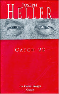
Book Covers for the Same Book in Both Markets
Now compare a few American book covers that have been changed for the French market:
 |  |
 |  |
 |  |
The US-to-France cover conversion has to do partly with international rights, which in my brief research (see above note about spending too much time on Pinterest) seems to vary by publisher. But it also is an intentional choice to appeal to the markets' differing tastes. It's mind boggling to me why anyone would prefer these boring French covers to the American covers.
So what's going on?
Boggle no more! Author Adria J. Cimino has uncovered the reason:
"There are some French publishing houses and collections that feature illustrated covers similar to those found in the U.S., but they don't represent an overwhelming majority.Hop over to Adria's blog to read the rest of her post. You'll be surprised to find out the reason French covers are so plain, at least to American and British eyes. It's more logical than you would think... so check it out!
As I looked at the sea of plain book covers at the recent Paris Book Fair, I knew there had to be a reason for packaging the written word in such a way. Covers in white, ecru, pale yellow or even red. Decorated only with the titles and names of authors and publishers.
So I decided to do a bit of research. First stop: Les Editions de Minuit..." Read More
Want more? Subscribe to receive an email when I post a new article, or follow me on Facebook, Twitter, or Pinterest.

